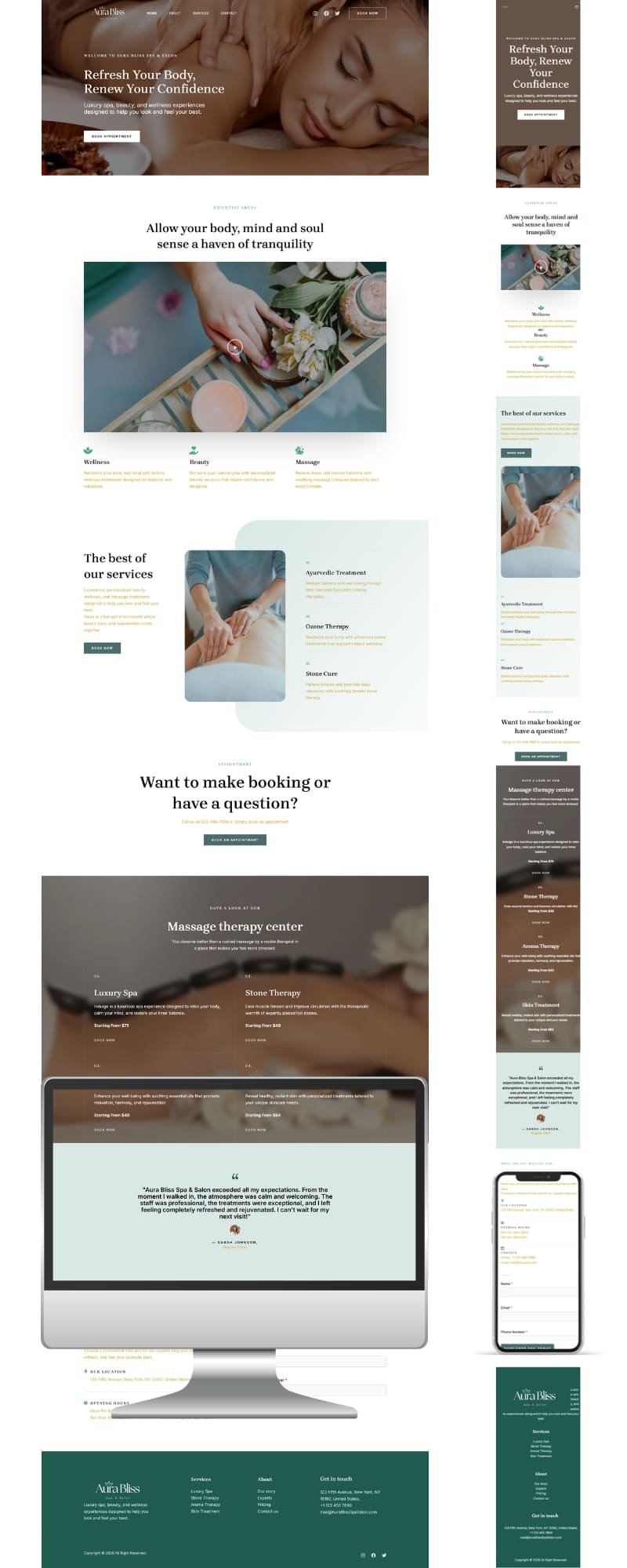
A pretty salon website means nothing if it doesn’t convert visitors into booked appointments. The best salon website examples balance strong visuals with frictionless booking — a big photo doesn’t help if the client can’t find the “Book Now” button in three seconds.
Below are 10 real salon and spa website examples that get this balance right, plus the one lesson you can steal from each for your own site. If you’re still deciding how visitors will actually book after seeing your site, check our booking plugin comparison first — it pairs directly with the design lessons below.
Disclosure: This post recommends tools and services based on personal use and experience. If I join an affiliate program for any of these in the future, I’ll clearly mark those links as affiliate links.
1. Bathhouse (Spa)
A high-end spa and retreat brand featured in Vogue, offering thermal pools, saunas, and steam rooms.
What works: The homepage sells an experience, not just a service list — big lifestyle photography before any pricing.
Takeaway: Lead with the feeling your service creates, not just a menu of treatments.
2. Amaci Salon (Hair Salon, Boston)
An award-winning luxury salon with a polished, editorial-style homepage.
What works: Client testimonials are placed high on the page, right after the hero — building trust before asking for a booking.
Takeaway: Don’t bury your reviews at the bottom. Put social proof near your CTA.
3. Kaleido Hair
Known for its award recognition (Beauty Launchpad Top 20 Salons) and a strong “who we are” message above the fold.
What works: An image slider mixing real client results with a rotating testimonial carousel — style and trust in one section.
Takeaway: Combine your portfolio and reviews in the same scroll section instead of separate pages — fewer clicks to conviction.
4. Treatwell
A large, multi-location beauty booking platform with a very clean navigation structure despite offering dozens of services.
What works: Simplicity in navigation even at scale — services are grouped by category, not listed as one long menu.
Takeaway: If you offer 15+ services, group them (Hair / Skin / Nails) instead of one giant list — it reduces decision fatigue.
5. Le Petit Salon
Known for the most energetic, colorful branding among salon sites.
What works: Bold color use guides the eye directly to the booking button — color isn’t just decoration, it’s a visual funnel.
Takeaway: Use one bright accent color exclusively for your CTA buttons so they never blend into the page.
6. Parlor by Haides
A minimalist salon site that leans heavily on whitespace.
What works: Whitespace makes the brand feel premium and unhurried — it doesn’t try to fill every pixel.
Takeaway: More empty space around your photos and CTA often reads as more expensive, not less finished.
7. Yukienatori (NY Beauty Salon)
A distinctive site with a water-ripple animation and toggleable sound.
What works: A memorable interactive detail makes the brand stick in visitors’ minds — but it doesn’t get in the way of the booking flow.
Takeaway: One creative touch is memorable; five is distracting. Pick a single “signature” design moment.
8. Barb Styling
A minimal, modern hair salon site built around a clean two-color palette.
What works: No visual noise — every element on the page either shows work or leads to booking.
Takeaway: Before adding a new section to your site, ask: does this help someone book, or is it just filler?
9. The Color Lounge
A stylist-founded salon site with a strong personal-story section.
What works: The “founder story” builds a human connection that big chains can’t replicate.
Takeaway: If you’re an independent stylist or small studio, your personal story is a competitive advantage — feature it, don’t hide it in an About page nobody visits.
10. Glamz-style Template Sites (Dribbble-inspired builds)
Sleek, sophisticated designs popular for premium salons that also sell retail hair products.
What works: Built-in shop integration lets clients buy products without leaving the booking flow.
Takeaway: If you sell retail products (oils, tools, gift cards), keep the shop one click away from booking — don’t force a separate site or platform.
The Common Thread
Looking back across these salon website examples, three things repeat every time:
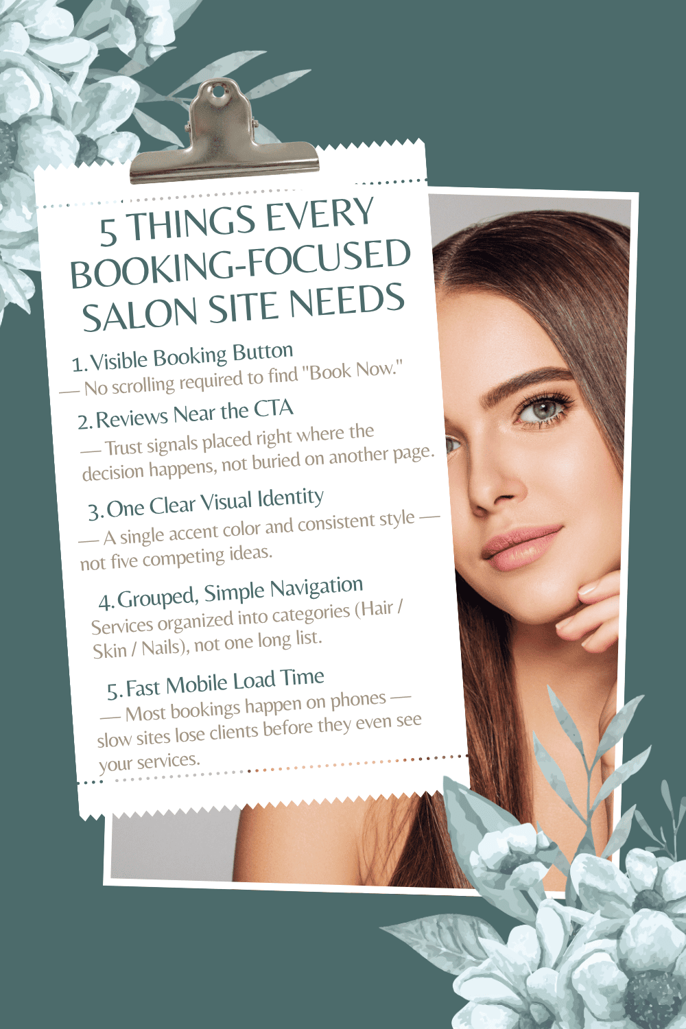
- The booking CTA is visible without scrolling — never buried.
- Trust signals (reviews, press, before/afters) sit near the CTA, not on a separate page.
- One clear visual identity — a color, a font pairing, a signature animation — not five competing ideas.
For a deeper look at how footer design affects trust and conversions specifically, see our footer best practices guide. And if you want a broader visual reference beyond these 10 salon website examples, Colorlib’s salon website roundup is worth browsing too.
That’s exactly the framework we follow when building spa and salon sites at SpaSalonWeb: fast-loading, mobile-first, booking-focused design — not just “pretty.”
Want a Website Like These? Let's Build Yours.
Frequently Asked Questions — salon website examples
Q1: What makes a salon website design "good"?
A: A good salon website isn’t just visually appealing — it gets visitors to book. That means a visible booking button, fast mobile load times, and trust signals like reviews or before/after photos placed near the CTA, not buried on separate pages.
Q2: What platform should I use to build a salon website?
A: WordPress with Elementor and a booking plugin gives you the most flexibility and lowest long-term cost, especially if you plan to add blog content or SEO pages later. Builders like Squarespace or Wix work for very simple one-page sites, but scale less easily.
Q3: How much does a professional salon website cost?
A: A custom-built salon website with booking integration typically runs anywhere from a few hundred to a few thousand dollars, depending on design complexity, number of pages, and whether e-commerce or membership features are included.
Q4: Do I need online booking on my website, or is a phone number enough?
A: Online booking is now expected. Clients — especially younger ones — often won’t call to book; if there’s no online option, they’ll simply choose a competitor that has one.
Q5: How many pages does a salon website actually need?
A: Most salons only need 4-5 pages to convert well: Home, Services, Gallery/Portfolio, About, and Contact/Booking. Adding more pages than that often dilutes focus rather than adding value.